
Designing and documenting a design system for ConnectWise–business management software for information technology teams.
My Role
♦ Creative direction, design, & documentation of the system.
♦ Trained team members on how to use the system in their designs.
♦ Worked with the development team to build out a shared library in both React and Angular JS
Goals
♦ Unify the products and create a better experience for our users.
♦ Streamline the delivery of new experiences.
♦ Create transparency and eliminate knowledge silos.
Why?
ConnectWise has multiple product teams in several locations throughout the US and globally. As the company grew, it became increasingly difficult to maintain a consistent style and visual language across the platform.
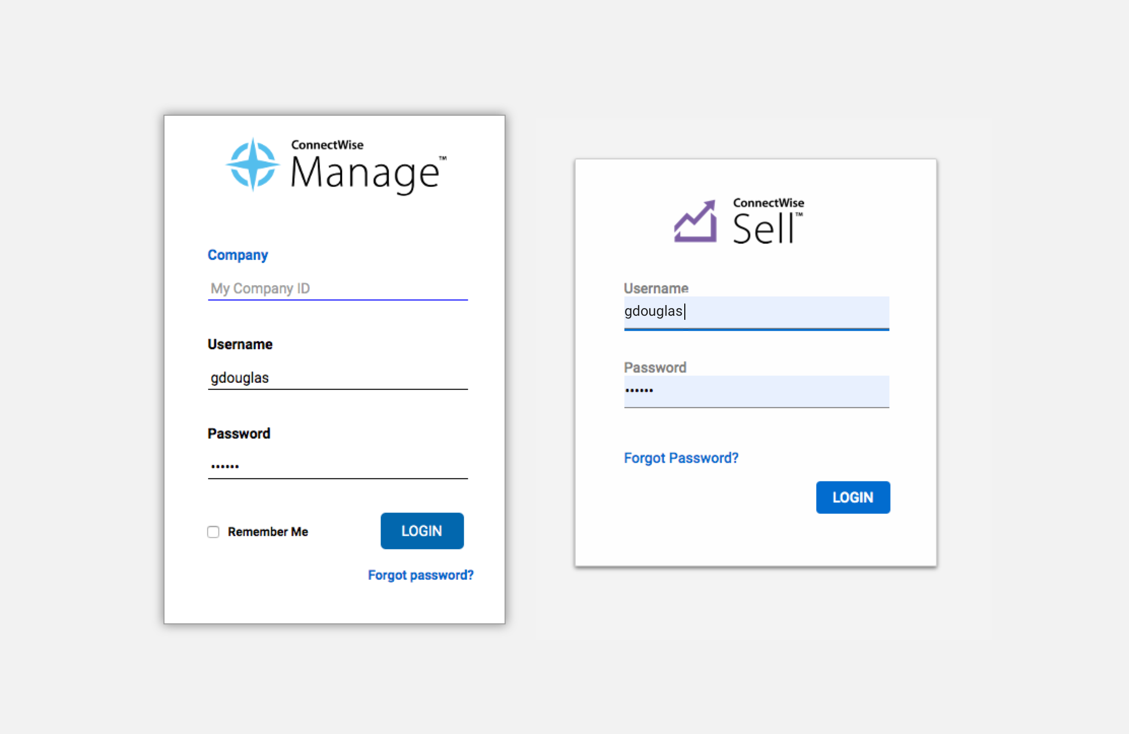
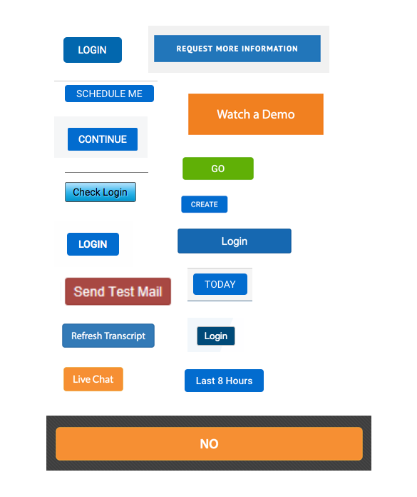
Take these two product login screens for example, how many inconsistencies can you spot?
The Challenge
The design team knew that this undertaking would be more than just updating the visual style of our products. For this new system to work, we needed to identify any inefficiencies, inconsistencies, & breakdowns in communication that caused us to have a fractured experience in the first place.
We went to each of the product teams and collected feedback from engineering, product management, and QA about their workflows, how they worked with design, and design handoff. We also gathered feedback from our users about the product’s visual design.
These are some of the things we heard:
♦ No transparency into why design decisions are made.
♦ UI keeps changing from project to project.
♦ There’s no single reference for how things should look & function.
♦ We have to ask a UI team member every time we need to check simple things like colors.
♦ UI is cluttered and outdated.
♦ It’s hard to find what I’m looking for.
♦ Overwhelming and complex.
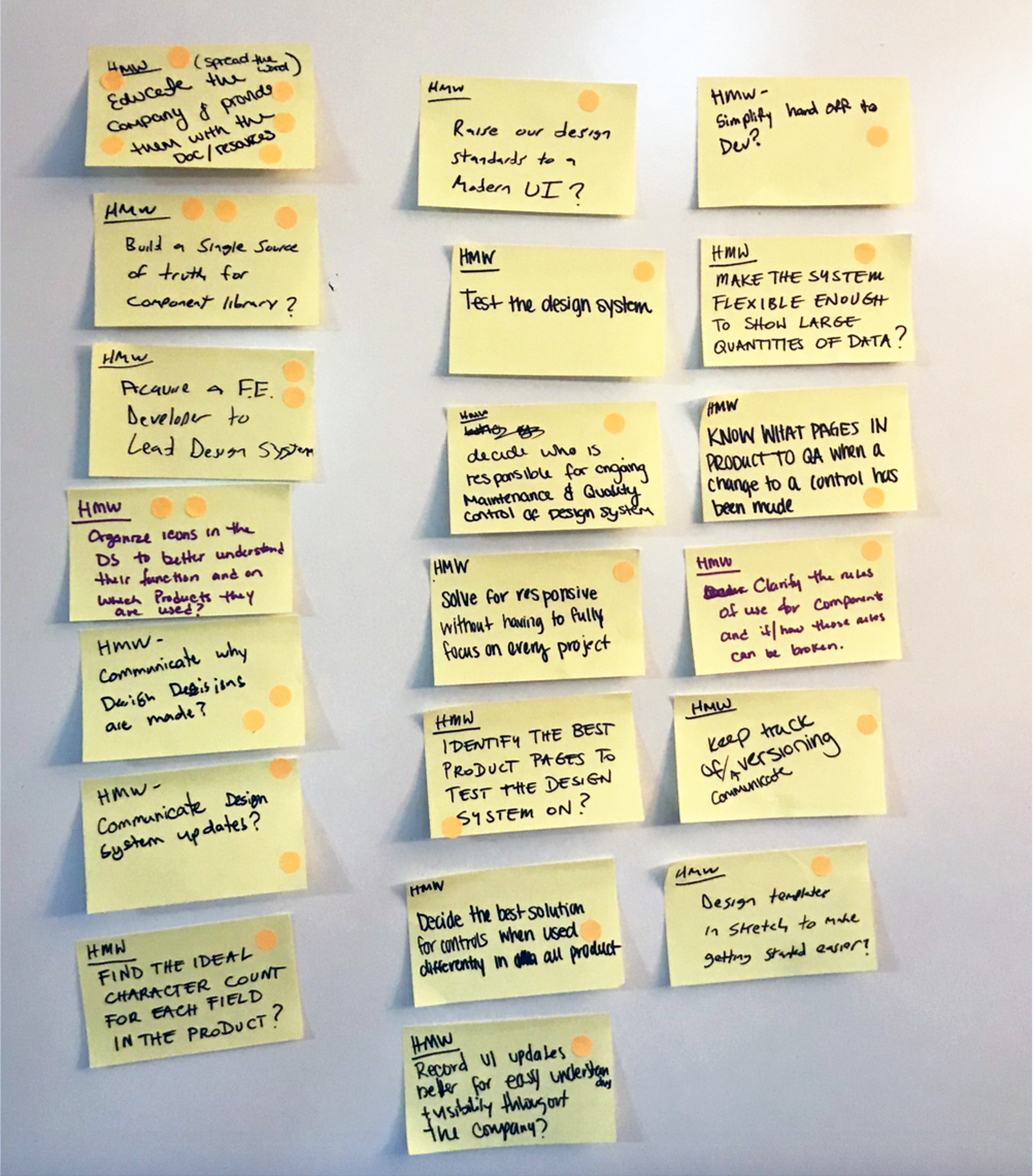
We wrote down feedback as ‘how might we’ questions to brainstorm solutions:
Discovery
We looked at other product design systems for inspiration: Google’s Material design, Atlassian, Mail Chimp, Uber, and Trello among others. These companies had already solved some of the same problems we were facing, so it helped to explore how those solutions might work for us.
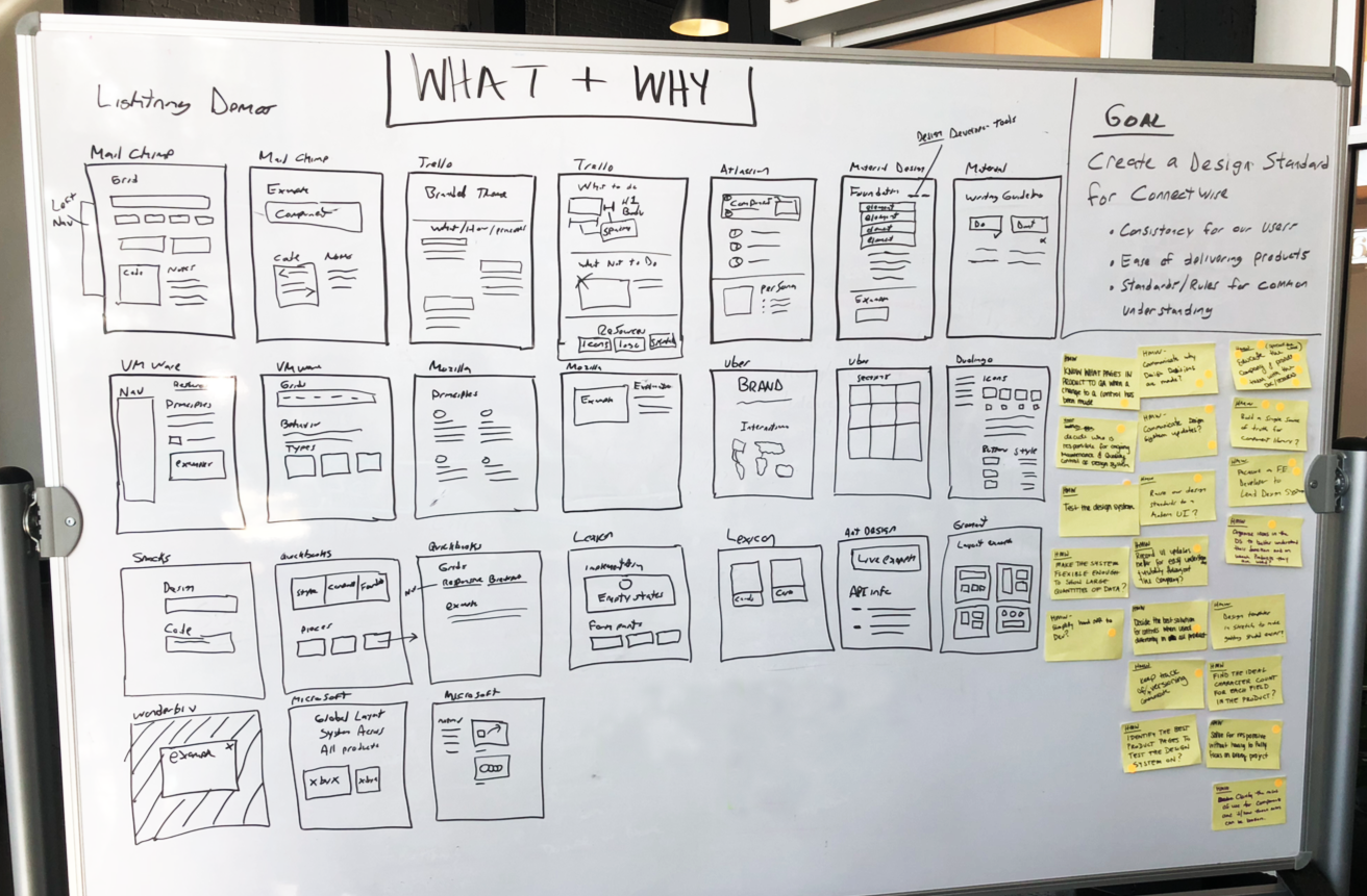
Designers from each product were asked to take a screenshot of every type of component and file it in Dropbox for review. This helped us build our case for change and gave us a clearer picture of just how inconsistent the current product experience was.
Need a button? We found 17 variations of primary buttons, which meant we didn’t have a ‘primary’ button at all.
Design
One of the main problems we had before this process started, was not having one centralized location designers or developers could go to see what components existed, how they were meant to be used, and how they could use them in their work. To solve this, the goal is to build a website that will house all of our components and documentation. The site will be maintained by a dedicated design system team, and other teams would be able to submit questions, feedback, or requests for new components to be added.
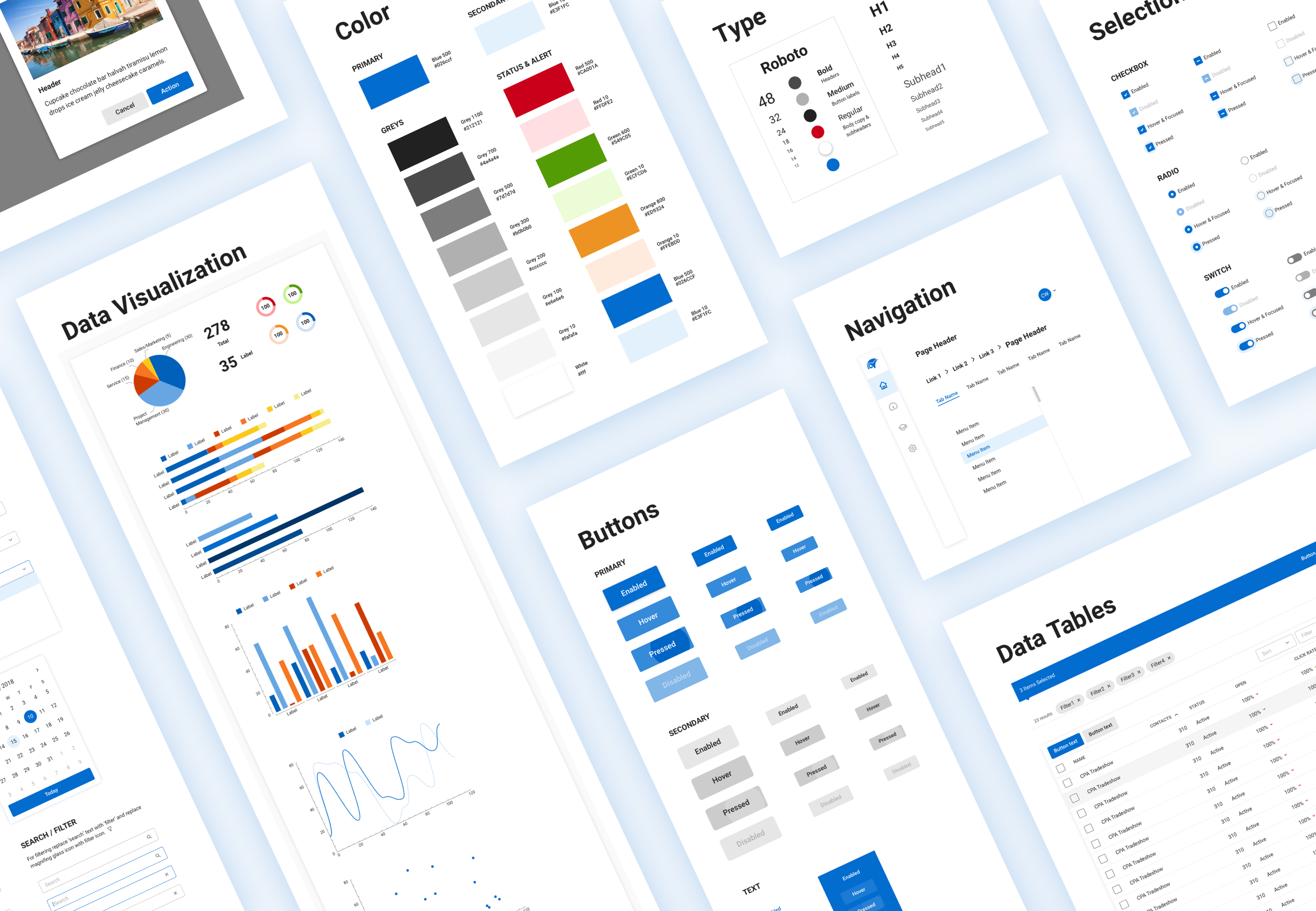
For the designers, I built a component library in Sketch using Atomic Design Methodology to guide the setup.
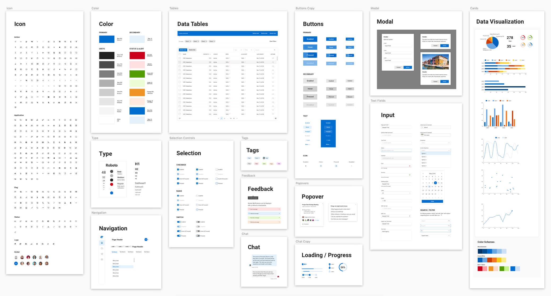
I considered accessibility as I was designing each component by checking the contrast ratios for text legibility and avoiding the use of color as the only indicator of a state change. When I got to a point where the designers could start using the UI kit to build out designs, I worked closely with them to see if there were any adjustments I needed to make or if anything was missing.
Building out the System
The Omni Design System is constantly evolving, it will always be a work in progress as things at the company continue to adapt and grow. What we have done so far has received positive feedback from product teams and our users. The design team spends less time pushing pixels and more time researching, ideating, and iterating; the development team spends more time building without having to worry about tweaking custom CSS, and the QA team can check our documentation site instead of waiting on design to answer simple questions. Having the ability to quickly create hi-fi design mockups helps us communicate ideas better with project management, leadership, and our users.
You can see the design system put to use in the People’s Portal project.